2019 Boston University MFA Thesis Exhibition Branding
Branding, Identity, Motion Graphics, Print & Digital Collateral
Branding, Identity, Motion Graphics, Print & Digital Collateral
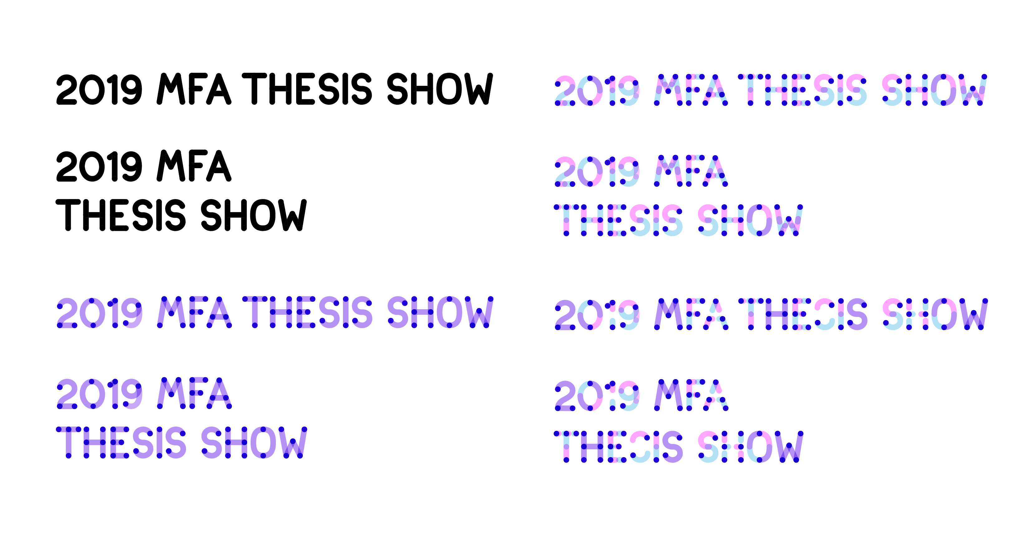
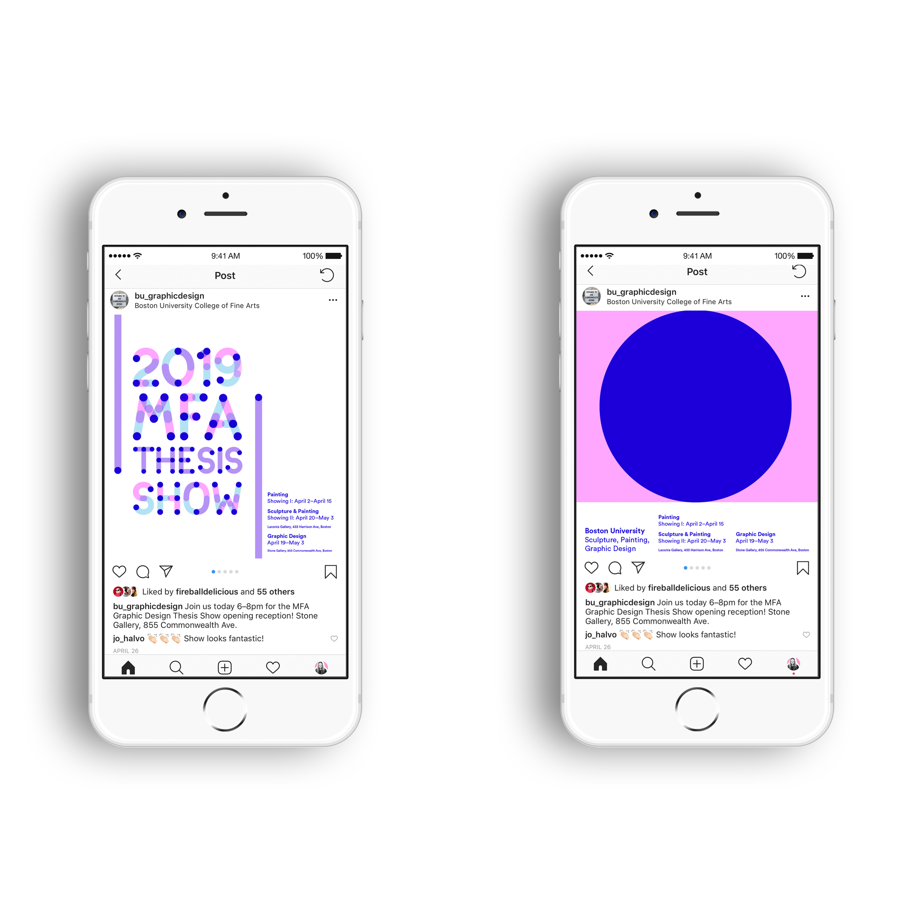
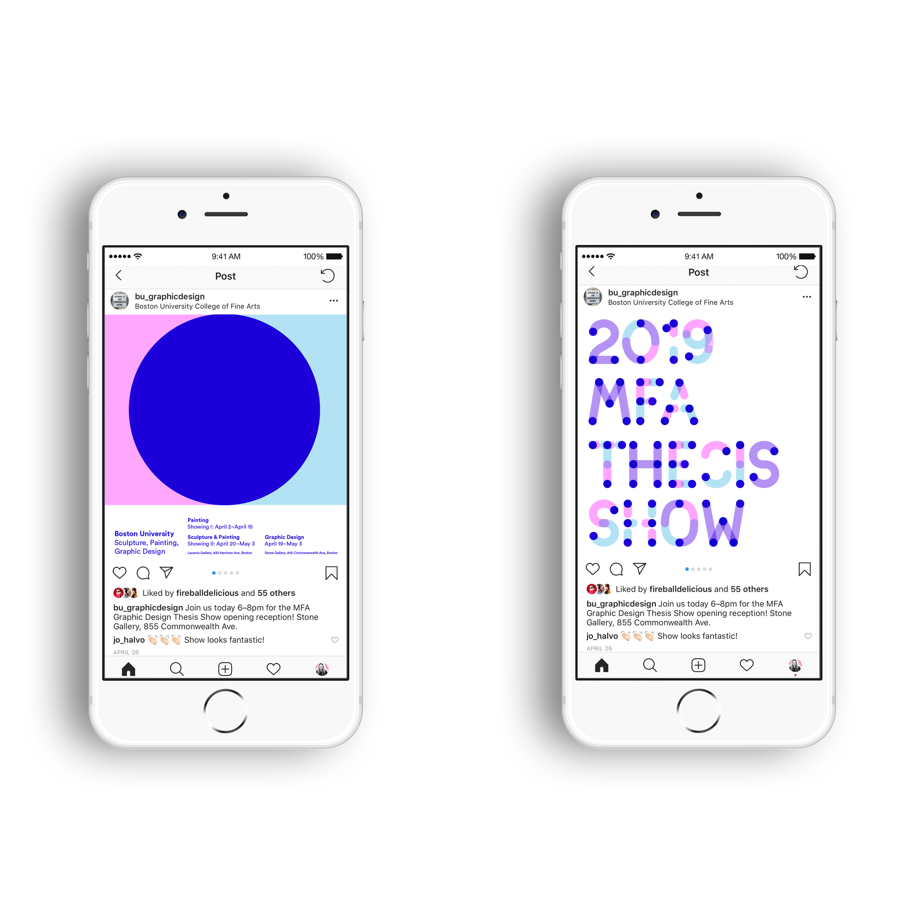
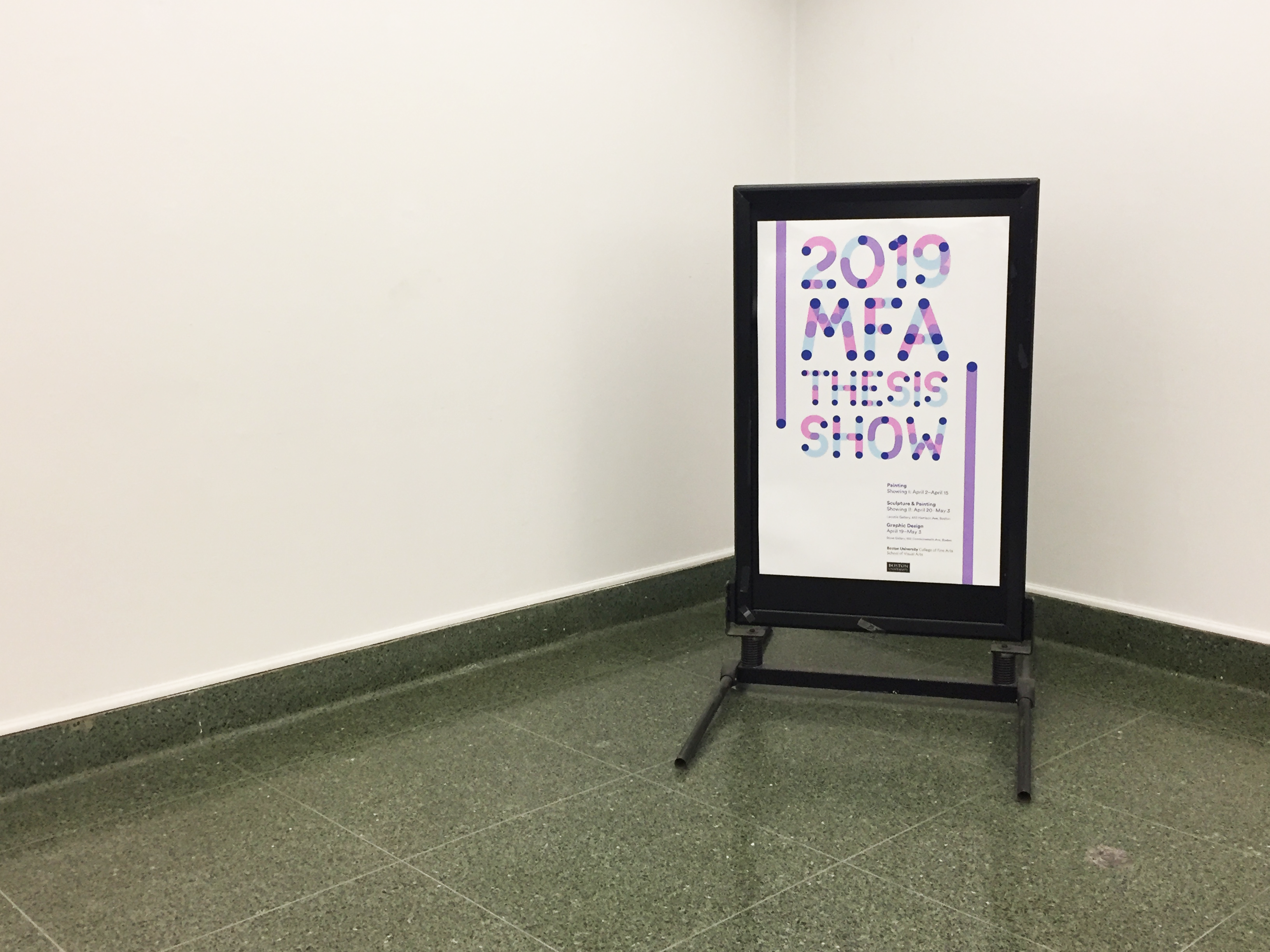
As students, artists, and designers we are linked through the relationships we have with each other, our work, and the outside world. Representing both visible and invisible connection as the theme for the 2019 MFA Thesis Exhibition, our identity included kinetic and static forms. Using dotted points as representation for individual moments of connection, moving lines intersect these points to create form. Digital graphics for web and social media are both kinetic and static, featuring layered intersections between lines and dots. Printed media captures static moments of the kinetic form, representing the in between, paused, moments of connection.
Design Team: Brittany Latham, Sarah Freidman, and Casey Devaney
Parallel to the unique experience of our concept, we have created a custom alphabet to use for major headlines and artists’ names, which represents the authenticity of a connective experience. Our identity is fluid and dynamic, allowing us to physically represent and account for multiple locations, various marketing deliverables, and wayfinding, while also allowing us to account for the diversity in work exhibited.
Brand Guidelines


Type Lock Ups


