School of Social Policy
University of PennsylvaniaThe brief
For more than 110 years, UPenn’s School of Social Policy, SP2, has contributed to the advancement of more effective, efficient, and humane human services through education, research, and civic engagement. SP2 looked to our team to re-design their website to reflect their growth, organize their content, and modernize their brand story. The challenge
With a large history of impact, comes a large record of information. Our biggest challenge was to dive deep into existing architecture and content, restructuring and simplifying as needed, to produce an experience that easily and efficiently produces accurate results. The opportunity
With a national university ranking #6, amongst its Ivy League competitors, and national acceptance rates declining, SP2 was at a crucial time to position marketing to showcase its competitive advantage. 
The solution
We worked closely with our content and development partners to deliver a website driving donor engagement, increasing conversion, and ultimately augmenting the count of accepted students. The results
4.5% increase in enrollment between academic years (SP2), despite a .3% decrease in UPenn’s acceptance rate (www.crimsoneducation.org).


The details
Highlighting SP2’s database of 900+ partnering agencies providing opportunities for students.
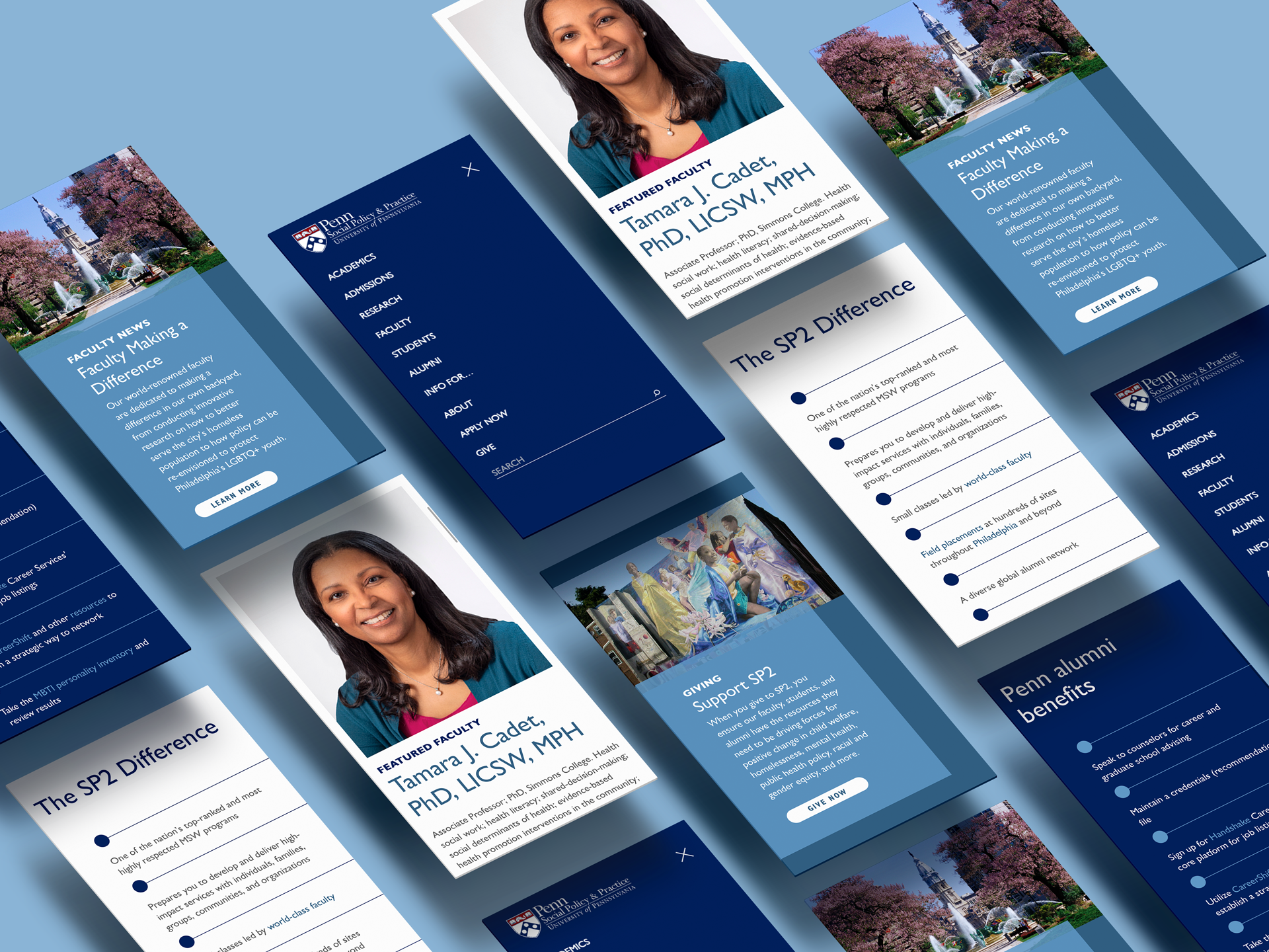
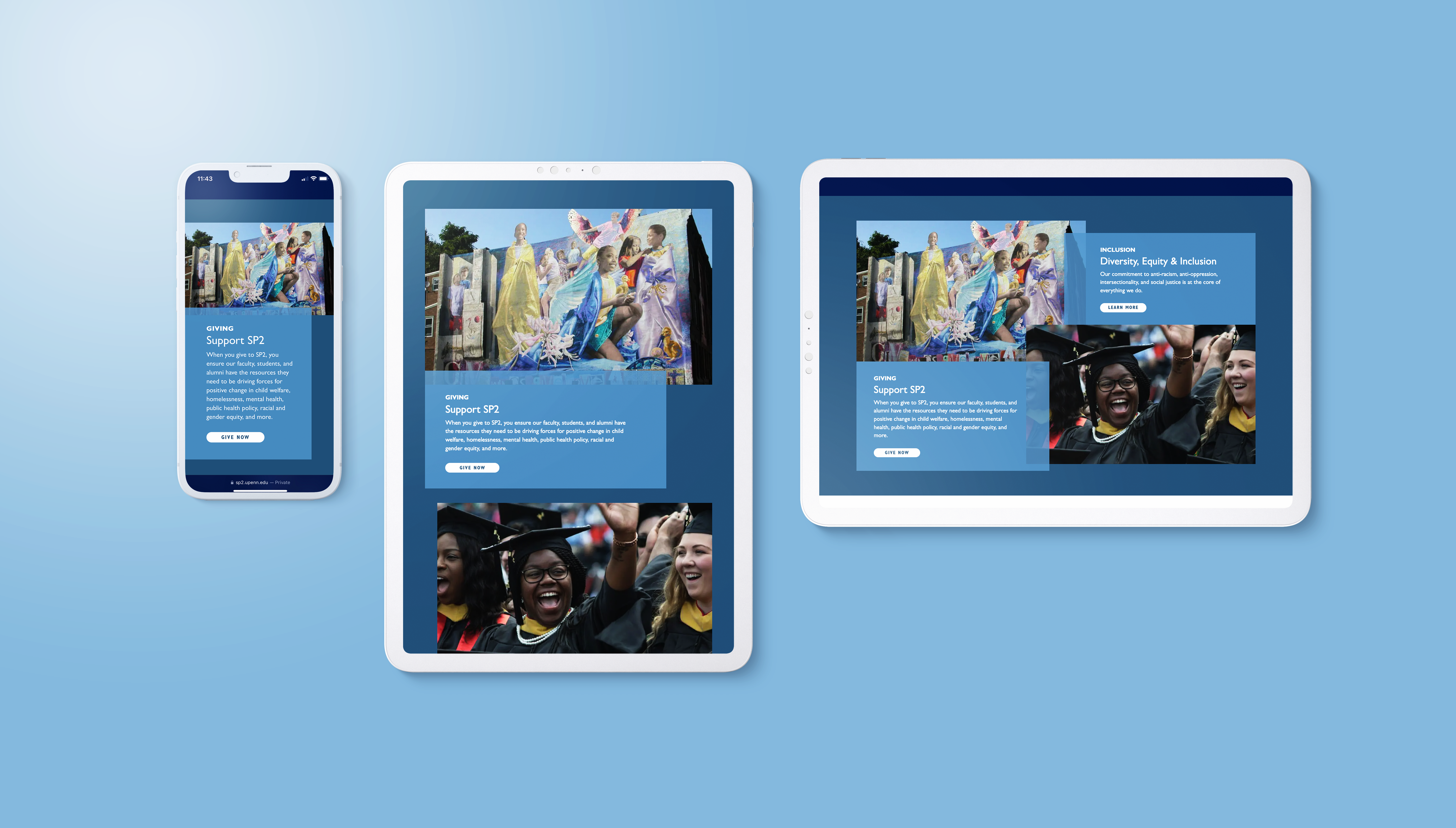
New messaging and imagery highlights UPenn’s impact throught its connection to Philadelphia, and national and local organizations. This was also an opportunity to highlight research efforts and appeal to both incoming students looking to make an impact and donors looking to give.
New messaging and imagery highlights UPenn’s impact throught its connection to Philadelphia, and national and local organizations. This was also an opportunity to highlight research efforts and appeal to both incoming students looking to make an impact and donors looking to give.
3-click Yield Compliance.
We enhanced user efficiency through introducing a new navigation, featuring a mega-menu, that is easily scannable from top to bottom. We also inlcuded enhanced SEO that optimizes high-value pages, tagged categories that lead to news features, and cross-tagged categories to relevant faculty pages.
We enhanced user efficiency through introducing a new navigation, featuring a mega-menu, that is easily scannable from top to bottom. We also inlcuded enhanced SEO that optimizes high-value pages, tagged categories that lead to news features, and cross-tagged categories to relevant faculty pages.
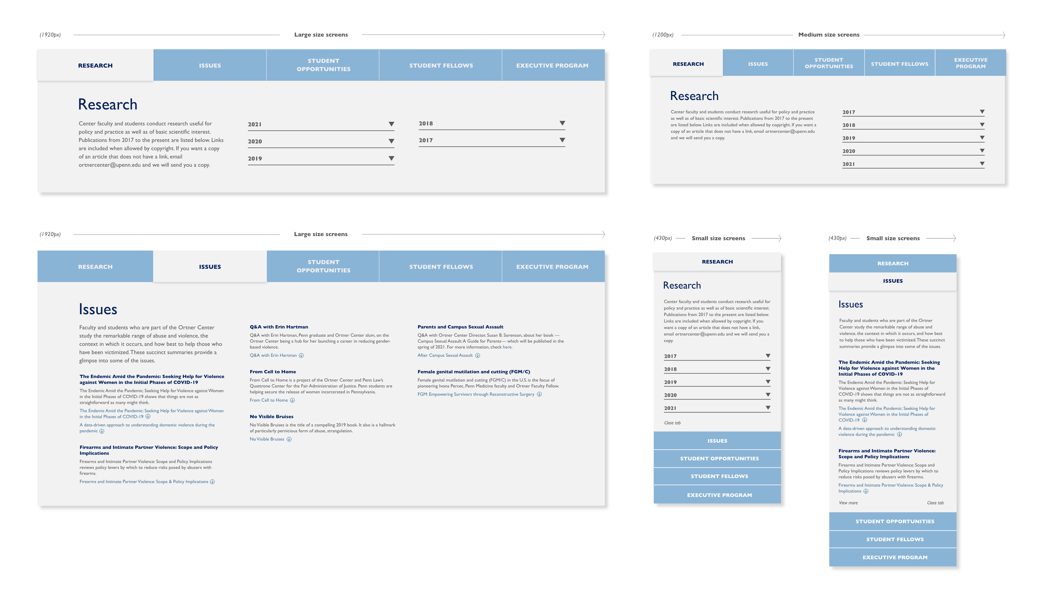
Our number one design goal was to simplify.
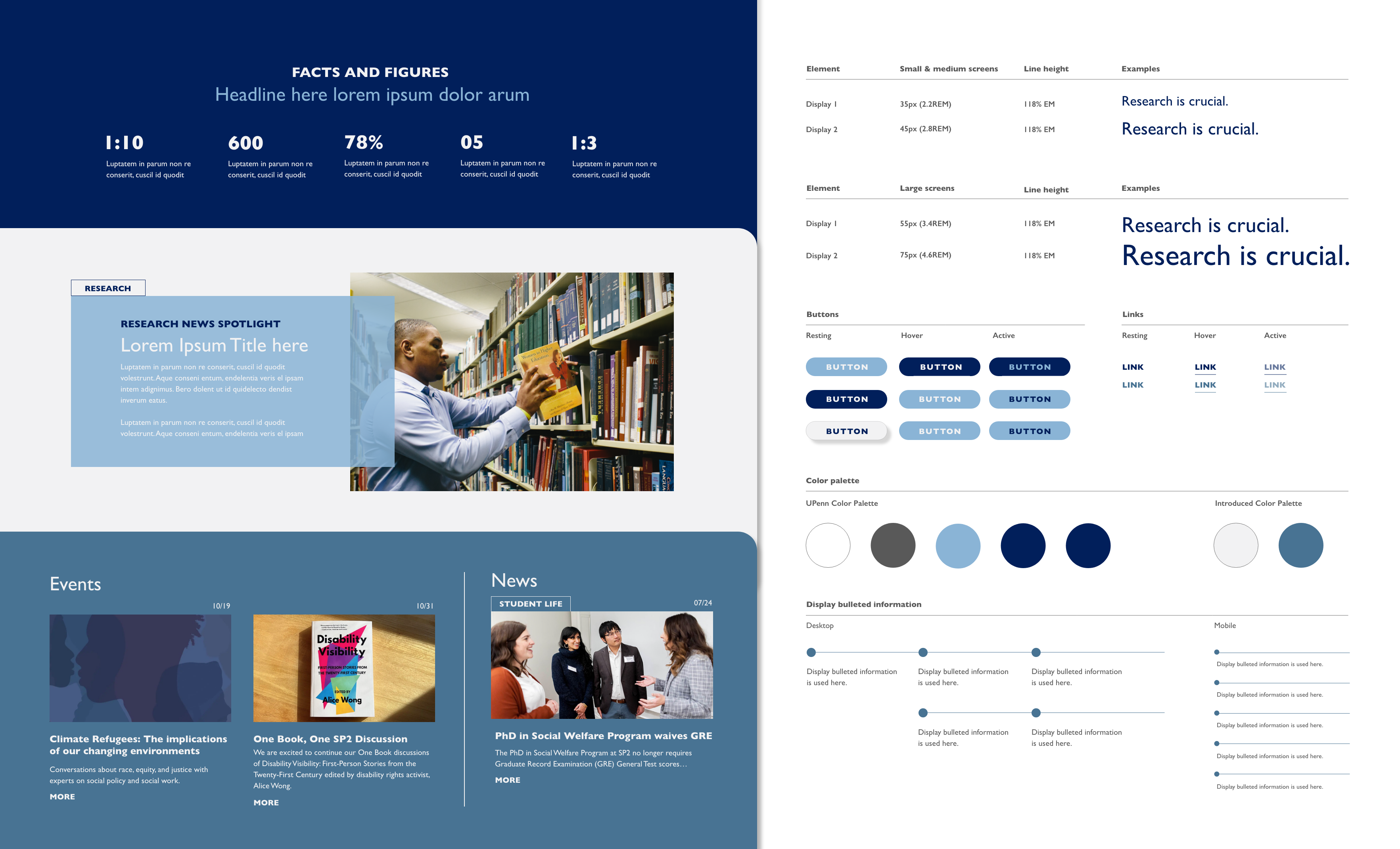
To help achieve this, we updated the brand by introducing two new colors into the palette, creating a responsive typographic system, introducing new graphic elements to highlight research-specific CTA’s, and used a tags to alert the user of searchable categories.
To help achieve this, we updated the brand by introducing two new colors into the palette, creating a responsive typographic system, introducing new graphic elements to highlight research-specific CTA’s, and used a tags to alert the user of searchable categories.


My role:
Qualitative Research, UX Design, UI Design, Information Architecture, Creative Strategy, Art Direction, Branding, Project Management
Qualitative Research, UX Design, UI Design, Information Architecture, Creative Strategy, Art Direction, Branding, Project Management
Design Lead and Art Direction: Brittany Latham
Design Team: kor group, MB Jarosik, Vaishnavi Kumar, and Travis Tyler
Content Partner: 43,000 Feet
Web Partner: Michelle Curran Web
Design Team: kor group, MB Jarosik, Vaishnavi Kumar, and Travis Tyler
Content Partner: 43,000 Feet
Web Partner: Michelle Curran Web